

Have you ever stumbled onto that part of the internet that was created in the 1990s?
It was a wild and wacky time for website design. With just 23,500 websites in 1995, you could get away with a lot. We’re talking a bright orange background, a few photos stretched hideously into the wrong aspect ratio and all the headings lovingly created in Wordart.
Now, with iPads and 50” inch television screens with their own built-in browsers, people demand more. Internet users want websites that are not just easy on the eye. They want a website that is adaptable and responsive to whatever screen they have.
But often that’s easier than you think. Here are 10 common website design mistakes every website rookie makes and how to fix them!
Top 10 Common Website Design Mistakes to Avoid in 2024
1. Your Website is Not Mobile Friendly
With more Google searches on mobile devices than computers in the U.S, a mobile-friendly site provides the best customer experience and is crucial for staying competitive.
Responsive websites are ones where the overall content, design, and information is the same on a desktop site as it is on the mobile site. The key difference is that it has been adapted to fit that particular screen size. This is the preferred format that overwhelmingly provides the best customer experience.
If you check out our website on your mobile you’ll see it’s been adapted to fit a portrait style screen. If you scroll down you can see our articles in a descending list. On an iPad, our website displays our articles in a long banner because there is room on a wider screen.

2. Your Website Load Time is Longer than 3 Seconds
In the 1990s even a website the size of a Word doc (we’re talking KB, not MB) took ages to load. And the average user, with their dial-up internet, expected to wait. Now, anything longer than 3 seconds and you’ve generally lost ‘em. Longer loading time means more loss on potential customers and making sales.
Google is on the side of the consumers and in a way – helps you grow your business too. Its search rankings now take loading times into consideration, even on mobile sites.
Large image sizes and unnecessary embed videos can slow down your site. Google considers loading time in search rankings, so it’s essential for user experience and SEO.
Pro-Tip: Our favorite tool to check site speed is GTmetrix. You can create a free account and get monthly site speed reports directly to your inbox!
3. Contact Information is Buried and Hard to Find
Place your contact info prominently on the homepage or a specific ‘contact us’ page. Offer multiple contact options like forms, email, phone and a Google Maps link.
Don’t bury it in a sub-menu e.g having to contact us as one of the options within ‘about us’.
Another common mistake is substituting a contact us form box for contact details. We get it, you want to make it as easy as possible for people to contact you. We also know you don’t want to redirect them away from the website to an email program. But people like choices. If you’re selling something, be as contactable as possible.
Give them an option of a form, an email, a phone number and even give them your business address with a link to Google Maps.
4. Your Website is not Secure (No HTTPS)

Most browsers are pretty hot on security these days. There’s an expectation that the big players are going to go out of their way to stop the average internet user from getting a virus.
If your site isn’t HTTP secure, there’s a chance some users might not even be able to access it because the browser won’t let them in and this, in turn, brings down inbound marketing efforts.
HTTPS encrypts user data, enhancing security. It’s crucial for user trust and necessary if your site collects data, as non-HTTPS sites may be blocked by browsers. HTTPS scrambles and encrypts the text making it harder to be hacked.
5. Your Website 404 Page is Generic and Not Engaging
Ignoring your 404 pages and hoping no one notices just ‘ain’t going to cut it.
A giant sad face with an apology is one idea. Employing that irritating Microsoft paper clip from back in the day, asking whether you need some help with your 404, is another. Put a smile back on your customers’ faces, they will remember.
If you’re using a website building page like Weebly it has its own 404 error setting tool which should sort you out.
6. Too Many Different and Conflicting Fonts
Comic Sans, Times New Roman, Ariel. It’s tempting when you have so many choices, to just go for it and use them all. When it comes to webpage fonts though variety is not the spice of life. Unappealing fonts are one of the key web design mistakes to avoid.
Sans serif fonts don’t go with serif fonts and it’s jarring to the reader to keep chopping and changing. Either stick with a font that is easy on the eye or thinks about what font matches your business. If you’re a high-end printing business, trying to go for a formal, distinguished look, go for something that looks like handwritten calligraphy.
If you’re after a younger audience and you’re selling an interesting product try a font that looks like graffiti.
Depending on your budget you might also want to consider hiring a graphic designer. They can give you advice on a font that is right for you and even designs a unique font. An attractive page creates a good impression, it helps engage visitors of your website and eventually convert them into customers.
7. Your content isn’t Scannable
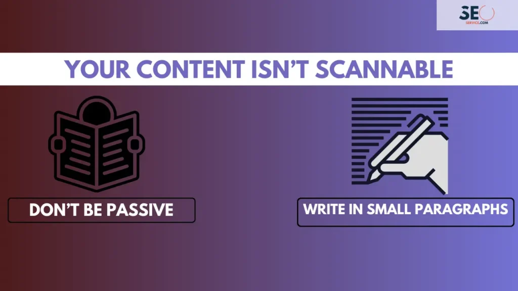
Here’s a shocking statement for you that Nobody reads what you write! Well… nobody reads your content properly even with the most intriguing headline written. Research by Neilson concluded that 84% of online readers scan rather than read word-by-word.
Use active voice, write in short paragraphs, and use subheadings. This makes content easier to scan, catering to the 84% of online readers who prefer scanning over reading.
To combat this you need to write in an engaging way that is too short and to the point. We want to be scanner friendly. Here are some tips on how to do that while increasing your rankings.
- Don’t be passive. Can you spot the difference between ‘The cat ran over the road’ and ‘the road was run over by the cat’? The first one is active: we’re in the moment with our friendly neighborhood feline, gasping for breath as we wonder if he’ll make it. The second one is passive. It’s as if the cat is irrelevant to the story. Be active.
- Write in small paragraphs. If you see a huge block of text, what’s your first instinct? Probably not dancing for joy. Paragraphs break up your ideas. The bigger your paragraph, the more complex and unwieldy your idea. Smaller paragraphs are more digestible and are easier on the eye.
8. Your Website is not Answering Questions
An FAQ page is a must for any website as it can immediately answer any burning questions. But having an FAQ page is not an excuse for filling your site with fluff.
Yes. Heavy blocks of text that say very little and aren’t easy on the eye. Cut it out! Instead, think carefully about what information your customer needs.
Then condense it and make sure it is spread out across the page with lots of subheadings and links to other pages on your site or get high-quality backlinks for an added ranking.
The menu should also be the hub of your site. It should be the customer’s first port-of-call for answering their questions.
Pro-Tip: Do some simple keyword research on Google by typing in questions you think your customers would ask. You can then see how others are answering them and use that a starting point for creating content people will find helpful.
9. Generic Stock Images
Generic stock images make your site look just that, generic. Not to mention how expensive they are to purchase from a stock image site like Getty. Customers want to see the real-life products they are going to get.
Stage a real life photo shoot of your office and your business. What better way to market using real-life product images than via image sharing platforms such as Instagram?
If you’ve got an ‘about us’ page, put faces to the names of your employees. If you’re selling cars or motorbikes don’t just rely on generic glossy photos of different models. Instead give customers the chance to see exactly the car they are going to purchase, parked up on the drive of your business.
10. Lack of SEO Consideration

SEO is the lifeblood of a good website. A huge 81% of shoppers do some kind of research online before they make a purchase. And very few of that 81 % is going to be dedicated enough to scroll past page 5 of Google.
You can eliminate all the common website design mistakes above and create the best website but if you haven’t thought about SEO you’re throwing away valuable traffic. Now is the perfect time to start learning what SEO is all about.
Beyond Web Design Mistakes to Avoid
Website design can seem complicated and these are just some common website design mistakes to avoid. If you are looking for Marketing Automation, Social Media and beyond, keep up with our blog for all of the latest content!