If you’re struggling to find expertise to optimize for landing page design – then never fear, you’re in the right place.
You need to refine your landing page design; it’s as simple as that. This is a surefire way to help boost conversions, build a rapport with your audience and increase your email list.
Luckily for you, we’ve put together a few handy hints and tips to help steer you in the right direction. Let’s dive in!
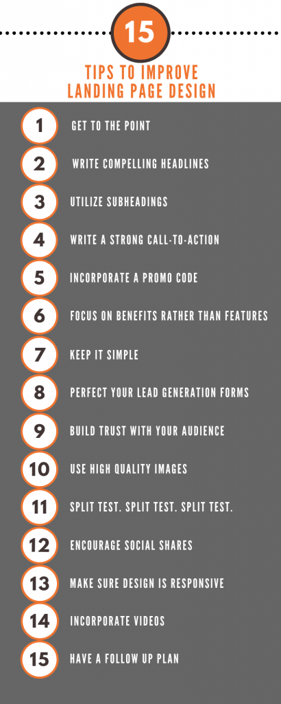
Tips at a Glance:
1. Get to the Point
You have roughly eight seconds to convert users, which means your landing page design need to convince readers your offer’s worth their time, instantly- trust us, it’s easier than it sounds.
Just streamline your copy. Listing useless info can overwhelm visitors, and increase the likelihood of them leaving the page.
Instead, keep copy concise and use simple language. In just a few words communicate the value you’re offering and explain how it’ll make their lives better.
2. Write Compelling Headlines
Your headline is the first thing visitors view on your landing page, so it needs to be perfect. It’s one of the main opportunities for converting users- so it’s worth spending time and effort on.
Pro-Tip: Your heading should state the most significant benefits of your products and services. This confirms to your visitors they’re in the right place and communicates precisely what your landing page does.
3. Utilize Subheadings
Use subheadings to explain in greater detail what your landing page offers. They’re excellent for showcasing the goods you’re providing, but from a slightly different angle to your main heading.
Just like your headline, the subtitles should help users understand exactly what you’re offering, and encourage them to consider your call-to-action.
4. Write a Strong Call to Action
Your call to action (CTA) should be both compelling and clickable. This is why buttons work well. They’re fabulous for encouraging visitors to follow through on your CTA.
Ensure your CTA, subheadings and heading all align with one another otherwise, you may confuse prospects. The last thing you want is visitors thinking your CTA’s linked to the wrong page.
Put simply: your copy needs to reflect what you’ve promised in your call to action.
Pro-Tip: Position your CTA above the fold, so users don’t have to scroll down to click.
5. Incorporate a Promo Code
Promo codes are fantastic for encouraging sales. In fact, 57% of consumers think unique deals on landing pages increase repeat custom and help brands stand out.
You can design each landing page to target a specific section of your audience.
The best thing about these web pages is that they’re entirely separate from your company website and store. This makes them a fabulous option for advertising to smaller sections of your target demographic (without impacting your broader marketing methods).
6. Focus on Benefits Rather Than Features
Your landing page is fabulous for showcasing the benefits of whatever you’re selling. However, these benefits should always be listed in bullet point format- you don’t want to swamp the page with text.
Kick off your list with the most significant benefits and gradually work down to the least important ones. This creates a value hierarchy and works wonders for engaging your target demographic.
Pro-Tip: Keep to a maximum of seven points. Any more than this and you’ll run the risk of overwhelming your visitors.
7. Keep it Simple
Minimalist designs are always the best. However, this doesn’t mean dull or boring. Instead, keep the design simple to avoid users getting distracted by unnecessary visual elements.
You also need to make your landing page scannable. This means utilizing larger fonts. This goes a long way in helping readers skim through your text.
Pro-Tip: Make sure there’s plenty of white space – this landing page design tip is amazing for keeping users focused on your call to action.
8. Perfect Your Lead Generation Forms
Always keep your lead generation forms short. This means only asking for essential information (their name and email address).
If you want to collect more info from your consumers, ask for it on your thank you page.
9. Build Trust with Your Audience
You need to show visitors you’re reliable. There are tons of ways to achieve this. For example, you could display any of the following:
- Quotes from the press
- Statistics
- Customer testimonials
- Trust badges
By trust badges we mean, logos from any of the reputable brands you’ve worked alongside or endorsements you’ve earned.
Think of all the above as ‘seals of approval‘ they’re amazing for giving customers confidence in you, and for moving them further through your sales funnel.
The stats speak for themselves, as many as 85% of buyers trust online reviews as much as a personal recommendation. So, take full advantage of all the positive feedback you’ve got from satisfied customers and publish these quotes on your landing page.
Social proof often gives users the final push they need to make their purchasing decision.
Pro-Tip: Make your logos square and edit them, so they’re grayscale. You want your landing page design to impress your visitors without distracting them from the offer.
10. Use High-Quality Images
Photos are amazing for enhancing user experience. Your visuals should help communicate whatever you’re trying to convey on your landing page.
For example, you can publish images displaying the best angles of your products. Or, you could have a few pics of your service in action. After all, they say a picture’s worth a thousand words!
Pro-Tip: You may need to hire the services of a professional photographer. Do your research and use someone who knows what converts for your niche.
11. Split Test. Split Test. Split Test.
In case you couldn’t guess from the subtitle, split testing is massively important.
Now you’ve got your landing page up and running; you need to take the time to test it- continually. As you go through this process, you’ll collect valuable analytics. Use this data to fuel the design of your landing page.
It’s the only way to achieve your highest conversion rate.
If you’re not sure what to test, here are a few things to start with: Things you can check:
- Your headings (headline and subtitles)
- Your CTA
- Imagery
- Trust signals
- Navigation links
Pro-Tip: Only change one element at a time. Otherwise, you won’t have any idea what’s driving your conversions.
12. Encourage Social Shares
Try and encourage as many social shares as possible by including icons on your landing page. However, don’t clutter your landing page by using too many buttons. Instead, focus on the social platforms your target audience enjoys.
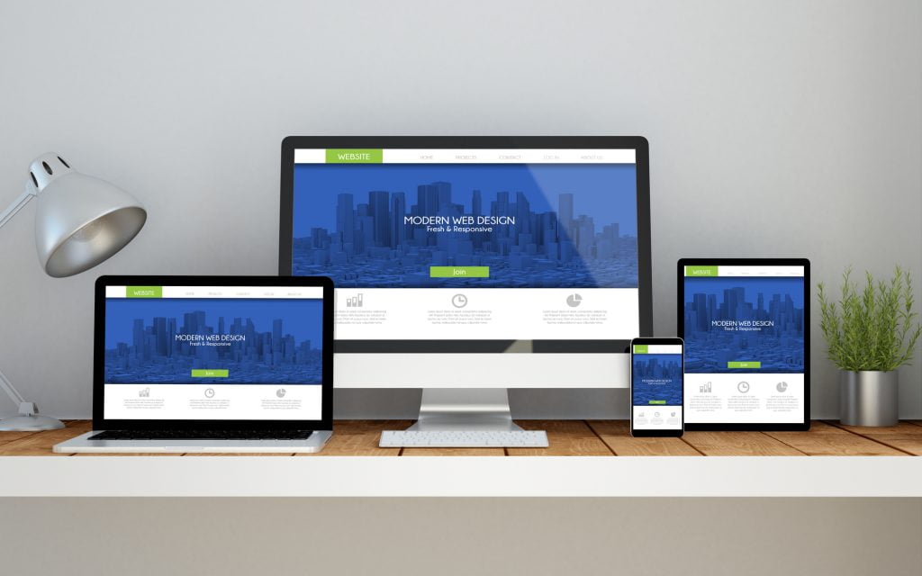
13. Use Responsive Design
Using responsive design is essential for reaching out and making the most of mobile users. Obviously, a mobile-friendly design should look looks fabulous on mobile devices, boast a quick load time, and should be clickable.
If in doubt, test your landing page to ensure everything’s as it should be.
14. Utilize Video
Depending on your target audience, a video might be better than standard photography. Video enables users a more comprehensive view of your product that images and copy just can’t replicate.
You can also utilize video to entertain your audience and provoke an emotional response from them- both of which are essential for generating a memorable user experience.
15. Have a Follow-Up Plan
It doesn’t matter what the overall goal of your landing page is; you need a plan for the users that click onto your CTA. For many marketers, this is where email marketing comes into its own.
Use automation marketing tools to keep in touch with new subscribers. You can provide them with a personalized experience jam-packed full of informative content– prospects love that!
An automated welcome series should be automatically sent to everyone who signs up to your email list via your landing page. With the help of software like MailChimp or Aweber, you could have this up and running with a few clicks of a button!
This series could include any of the following:
- Personalized order confirmations
- Customized invoices
- A thank-you email
- Product information
- A feedback form
You get the idea!
Did You Enjoy These Landing Page Design Tips?
If you found this advice on landing page design interesting, we’re confident you’ll love the other pieces published on our blog.
Over there we discuss everything from Google My Business tips to guidance on conducting useful keyword research enjoy!

